- Tue 20 February 2018
- Blog
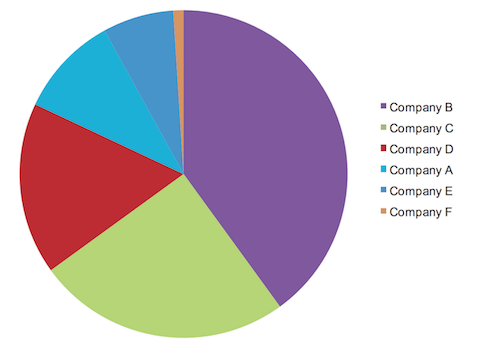
Pie charts are overly popular and widely used in the business world. However, as Stephen Few puts it in his book “Show me the numbers”, this kind of graphs is not efficient communication tool. He jokes that the author of pie charts, William Playfair, was probably under the weather when invented it.
Accordingly to Few, here’s the reason why pie charts poorly convey quantitative information. The human visual perception is not designed to accurately assign numbers to 2D areas. Therefore, we have hard time discerning quantitative values encoded with sections. Especially in case the values are close to each other. In the best scenario, we only can see that one slice is bigger than the other, but it’s hard to assess how much.

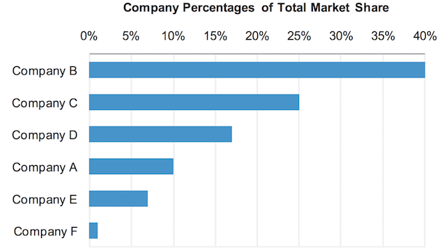
The same information can be presented in a more clear way with using bar charts. So that we can compare and interpret the data with ease.

That’s why Stephen strongly advises excluding pie charts from our repertoire. Because the true purpose of quantitative display is to efficiently give the readers important, useful and meaningful insights. Pie charts don’t help with this, despite their visual appeal.
Additional reading: